My role
Led the strategy. Conducted user research. UX design.
Team
Lagoon PM and engineer teams, documentation writer
Timeline
3.5 months


Discovery & research
User feedback from amazee's open source community repeated demonstrated that Lagoon needed to be easier to use if the technology was ever going to be widely adopted by the DevOps community. I needed to dive deeper to better understand what "easier" means to our users.
I interviewed members of the Client Services and Support teams about customer needs, as well as developers currently using the product. My interviews discovered:
While all users would all be considered "technically savvy," they had vastly different skill sets (some were web developers, some were IT ops, etc.) and not all of them had the skills to use lagoon.
Client Service and Support teams reported that users needed a lot of handholding. We weren't providing enough resources and support to learn how to use Lagoon or how to troubleshoot their deployments.
For most, Kubernetes is hard and complicated and scary. While Lagoon's "magic" is that you don't need to know Kubernetes to deploy your apps to Kubernetes, the user experience wasn't living up to that promise.


Strategy
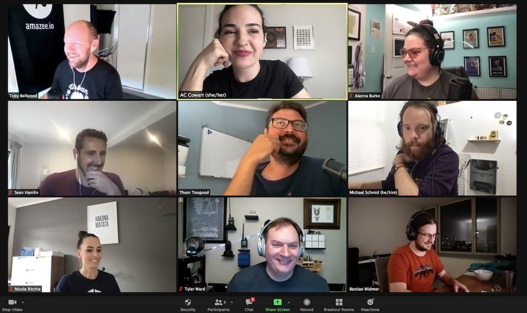
Because Lagoon was built by amazee developers for their own needs, it was essential to get internal stakeholders to step away from the mirror and empathize with external users. Using the insights from my research, I ran multiple workshops to align key internal stakeholders with a shared understanding of who our user were and the problems we were solving for them
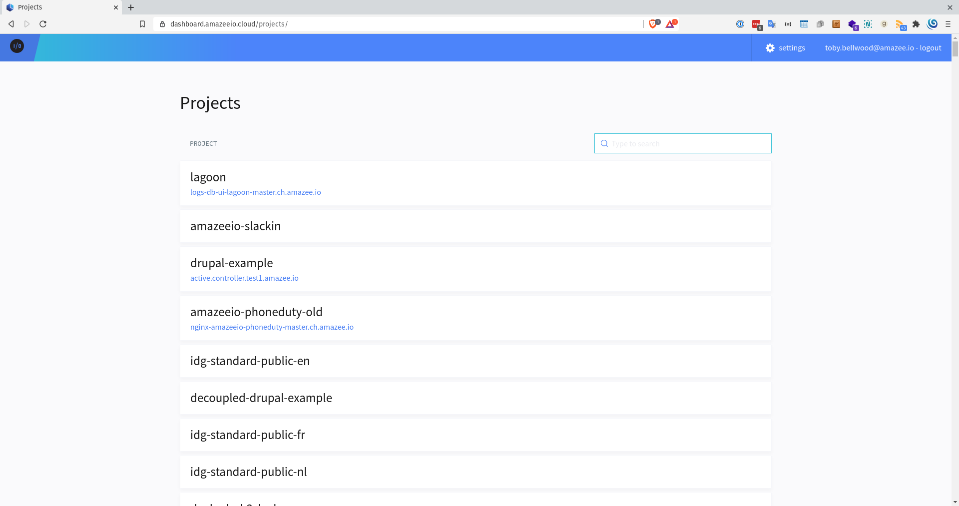
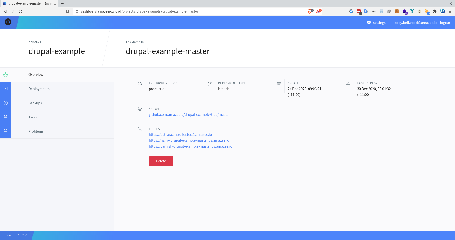
For our MVP, we identified and prioritized several opportunities to close the gap between the CLI and the old GUI with a brand-new GUI and the following improvements:
Surface more meaningful data that gives users the insights they need to better manage their deployments.
Rewrite the technical jargon micro copy into plain language.
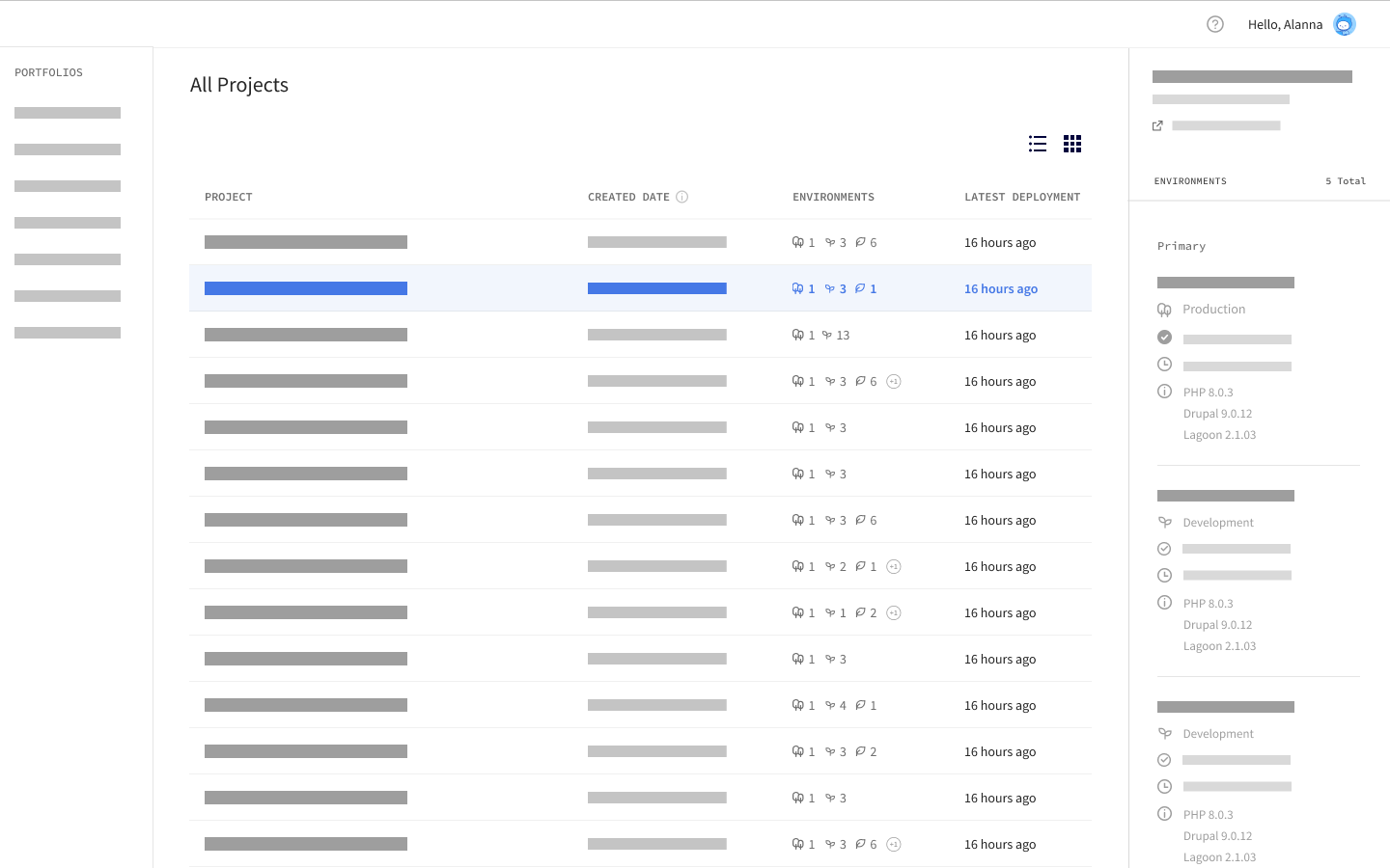
Give users with a large portfolio the tools to organize their projects while also giving them a high-level overview of their portfolio's health.


Results
My first prototype received positive feedback from both customers and internal teams we tested with. User testing on this initial prototype provided critical data on how to improve the next design iteration. We identified these next steps:
Some users found the concept of "environments" confusing. Find a way to display the necessary data, while not overwhelming or confusing users who don't understand environments.
Refine the complicated, multi-faceted filtering users will use to identify their "problem children".
Continue to speak to users and work with the Client Services and support teams to define the in-app support features.


